GRPH 223 / Typography
This studio course will introduce students to the practice, history, and theory of typography. Through design research, independent project work, and collaborative exercises; students will produce typographic solutions to applied and experimental problems using typography as their primary, if not exclusive, design element.
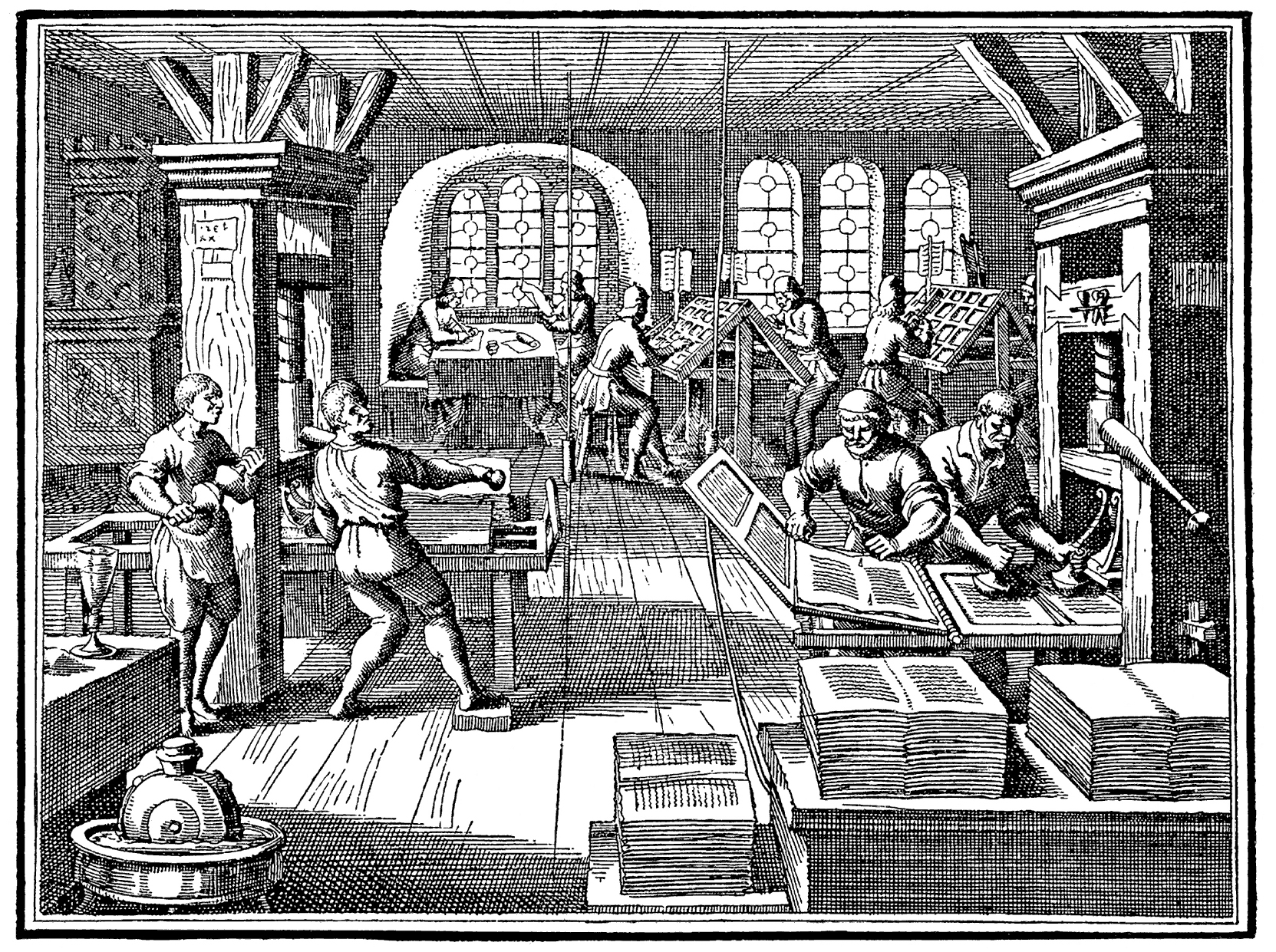
Course work will include independent student research, sustained project work, and critiques, emphasizing the perceptual and contextual properties of typographic design. Lectures, readings, and guided discussions will supplement project work, introducing students to the topics of letter form design, printing history, typographic classification, and textual representations.
To successfully complete this course, students will be expected to understand and emulate the principles of typographic practice that began in the early Renaissance and continue with contemporary digital design. Students will also be expected to demonstrate both leadership and collaboration skills while working with their fellow students towards the completion of project work.
Week 01 / 01
Introductions

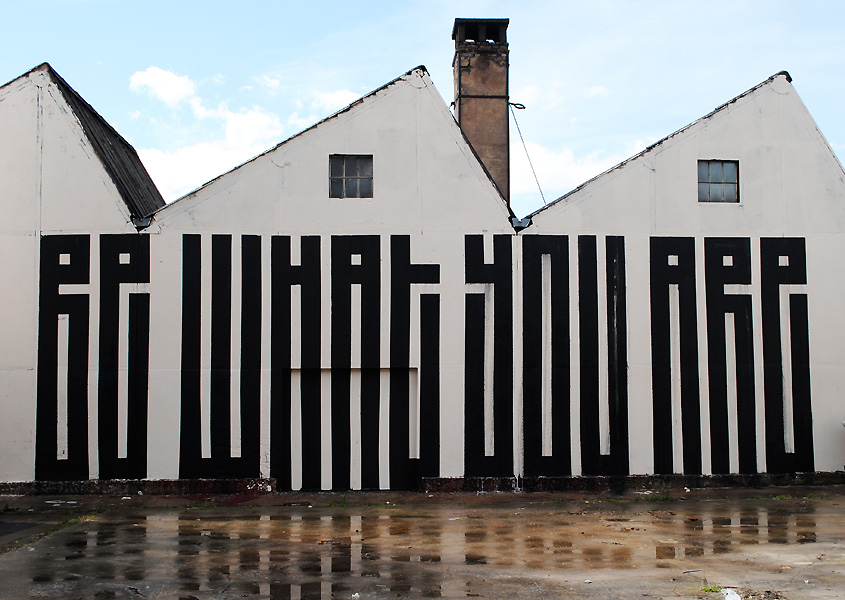
TYPOGRAPHICS!
Cooper Union / NYC
After the Bauhaus, Before the Internet: A History of Graphic Design Pedagogy
Introduction / Type as Identity
Course Syllabus
Course Deliverables
Canvas
Course Schedule
Typographic Design: Form and Communication, 7th edition,
by Rob Carter, Ben Day, Phillip B. Meggs, The Evolution of Typography
[required]
Visual Grammar, Christian Leborg
Thinking with Type, by Ellen Lupton [web site]
The Elements of Typographic Style, by Robert Bringhurst,
Foreword, Historical Synopsis
Typographic Design: Form and Communication [web site]

Adobe’s Creative Cloud Software Update~
*See Canvas for additional resources related to Typography. You will find an extensive list of suggested readings and resources, links to design organizations, and type foundries.
Eric Gill’s Process Book
Introductory Readings~
Who becomes a graphic designer?
What a graphic designer needs to know?
Write 5 questions you have from the readings. Be prepared to turn this in.
Week 01 / 02
Review readings.
Work in groups of 3 to outline the readings and discuss the questions that you have. Present your reponse to the readings as a group.
[.pdf presentation due in Canvas]
Exercise 01 - [On-going]
Type / Typology / Type Awareness
In class activity: Walking tour of Love Library / Special Collections / Nebraska History Museum / Children's Museum / Sheldon Art Museum to gather
typographic specimens.
Gather your type specimens in a folder on BOX or in Google Drive. Have them ready to share on Tuesday. [100 minimum samples]
Week 02 / 01
Present process for Exercise 01
Review found typography / type collected. Review found typography / type collected from the walking tour and your personal hunt.
Discuss what you have gathered and prepare to organize type specimens into categories of type classification. Demonstration on how to go forward and classify your type specimens. This will be an exercise that you participate in all semester. Look at this as an opportunity to create an archive of your typography finds.
Platform: Google Collections, Pinerest, Behance, Tumblr, Google Drive??
Type Activity:
Draw Type! Make tracings of your prize type specimens
Assign Exercise 02
Reference Readings:
Typographic Design: Form and Communication, 7th edition,
by Rob Carter, Ben Day, Phillip B. Meggs, The Evolution of Typography,
pages 1–32, The Anatomy of Typography, pages 33–52
Review
Thinking with Type
Ellen Lupton's Classification System
Read the following on Thinking with Type:
Anatomy of Type Presentation
Anatomy of Type / Ask Lynda
Anatomy of Type Animation
Letter Fountain / Names + Classifications
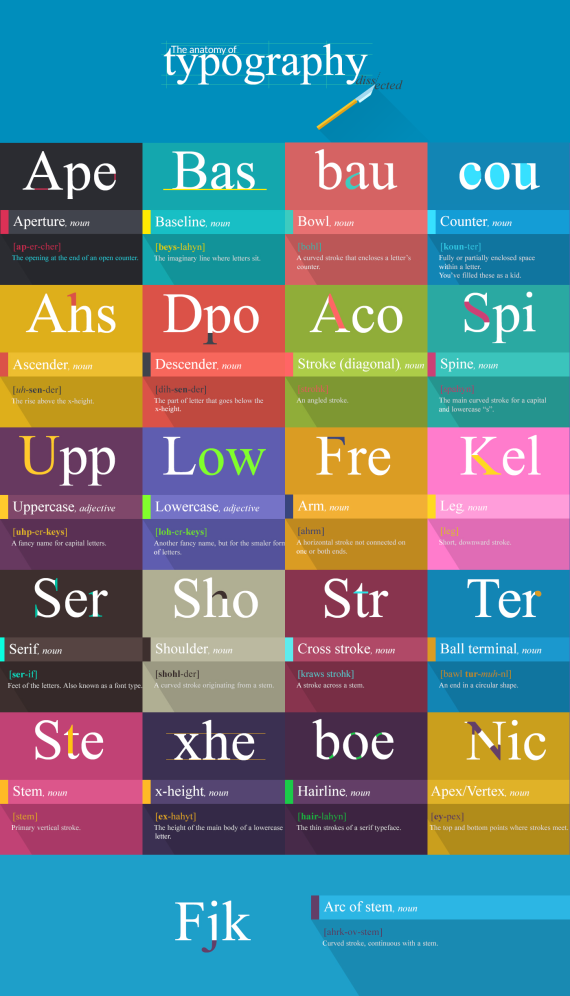
Anatomy of Letterforms
Week 02 / 02
Evolution of Typography Animated Short

Things to think about:
What is a type foundry?
What is the ITC in a font's name all about?


Typographic Definitions
Typeface and Font
A typeface comprises a family of fonts such as Garamond Regular, Garamond Italic, Garamond Bold, etc. A font is a specific weight or style within a typeface family, such as Garamond Italic.
Typeface Classifications
Serif and sans serif are the two most common typeface classifications. Serif typefaces have a more traditional look. Sans serf typefaces became popularly in the late 19th century and are considered to be more modern.

Letterform Anatomy from Ellen Lupton’s Thinking with Type
Units of Measure / Points / Picas / Inches
Humanist Serif / Humanist San Serif
Sabon / Garamond
Didot / Bodoni
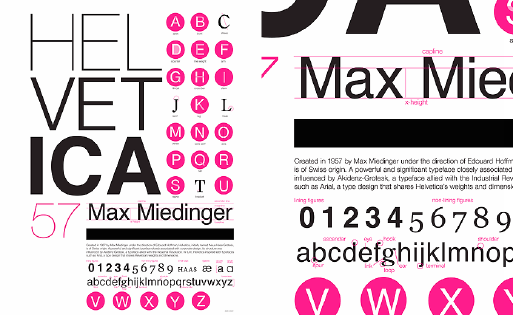
Aksidenz Grotesk / Franklin Gothic
Visual Compensation
Tracking, leading, kerning
What is a lock up?
Logotype Terminology
Relative or adaptive grid structures
Typography on screen
Some good stuff you want to know.
Learn how to see white space.

Learn how to enjoy the white space.


Stacy Asher
Associate Professor of Art
209 Woods Art Building
School of Art, Art History + Design
University of Nebraska–Lincoln
stacyasher@unl.edu
stacyasher.com